Sunday, December 28, 2008
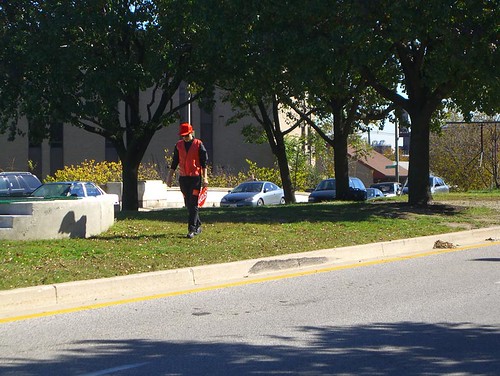
Border Stripes on Brooklyn Asphalt
Reposted from Bryan Finoki's Subtopia Blog:
A Subtopian Rainbow Under Your Feet
A relatively innocuous borderline has been literally drawn smack dab in the middle of downtown Brooklyn, we are told, absurdly enough, a “de-militarized “zone” only about one foot wide” to be exact.
Apparently there is a little turf war going on between the city’s construction workers and the federal employees at the site of the new federal courthouse, where both contingencies are vying for use (and perhaps control) of the parking lot. Funny. The line was painted by the city to advise construction workers to respectively stay on their own side with regards to storing equipment, parking, etc.
Even though it appears there is nothing really contentious going on, it’s interesting to see that an actual line has been painted on the street to make perfectly clear where city authority ends and federal power takes over. “Until 9-11," the Brooklyn Paper mentions, "the street (Camden Plaza East) was open for drivers, who could use it as a straight shot from Downtown to DUMBO. But after the terror attack, the feds seized it, citing security needs.”
I don’t know, I kind of like that the line was painted, for whatever reason. Makes me want to cruise around the nation, going city-to-city, with maps of each, some GPS nav gear, and maybe one of those professional pavement stripers you see city dudes driving in the middle of the street converted into my very own personal borderline striping chariot, and paint more of them -- federal versus local geographic lines in the city.
Better yet, what if geography departments in universities across the country coordinated a nationwide semester curriculum, so that each class could be responsible for marking similar boundaries in their own state’s prominent cities. The universal assignment would be just that: to simply roll around downtowns everywhere and outline all of the little unknown, unseen boundaries that exist between federal and local aauthorities as they are territorially distributed, on the streets, over sidewalks, in front of courthouses, underground in secret tunnels, around bollards, behind secret DHS buildings, ICE detention centers, weaving together districts of federal offices and military recruiter outposts in meandering perimeters of nice wet paint, for all to see; not missing, of course, the secret NSA listening rooms harboring in phone company HQ buildings, or the TSA interrogation rooms within airports, the research labs bellied in even the most liberal universities, old industrial sites, toxic brown sites, mysterious test sites, even new border fence property acquisitions, or national landmark buffers, and so on.
I would love to see an army of students and their professors invading the city with hordes of pavement stripers scrawling the margins of various no-access zones like mad, leaving nothing behind but a fresh coat of visibly territorialized entrails in their tracks. Along these trails there would be collection meters so that people could pitch in a few pennies for more paint.
Maybe once finished tracing the perimeters of the fed’s sovereign landscape within America's urban heartland in a nice and glossy black, the next semester these cryptic pavement stripers reveal another colored urban geography: the corporate privatizations of public space in royal blue; the following semester we find the redacted acreage of seized public park space marked in harsh lines of cement gray, and the next one after that the nation’s CCTV metro-surveillance grids appear on the streets in red, and the newly designated ‘free speech and protest zones’ in pink, then the anti-homeless panhandling spheres pop up around ATMs in green, the restricted day laborer gathering spaces on various street corners and parking lots appear in yellow, and on and on and on.
In the spirit of Ronen and Francis’ illuminated borders projects, I’d love to bring these subtle and unmarked boundaries to the surface, in a kind of crisscrossing rainbow of longitudes and latitudes similar to the guiding lines you find in hospitals on the floors and along the walls, where separate colors lead you to different quadrants and different departments within the hospital; a kind of architectural navigation system for the institution's compartmentalized bureacracy.
People could then tour these rainbow grids at lunch, or on the weekends, and just take a little cruise of the hidden geographies of America’s urban landscape, along the way dropping a little spare change into the meters so all the kids could be supplied with fresh paint for next semester. By Bryan Finoki
Link to SUBTOPIA blog
Wednesday, December 17, 2008
Sunday, December 14, 2008
Letters
http://www.thislife.org/Radio_Episode.aspx?sched=629
Letters have this bizarre intimacy that seem strung out on a limb because of their blatant hope for correspondence. Its almost like talking to yourself; hearing these bits of others without knowing the whole story throws me off a bit but in a way that I feel slightly suspended over the narrative.
Saturday, December 13, 2008
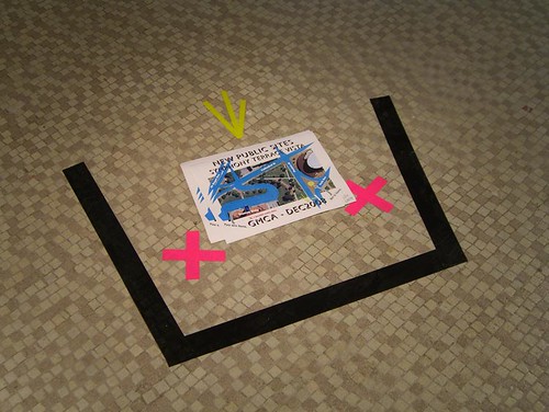
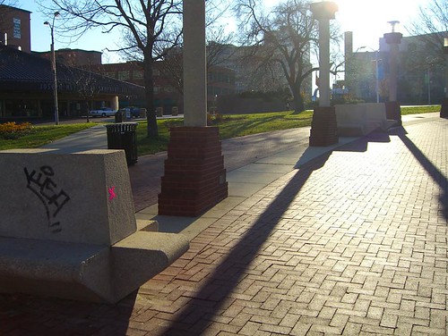
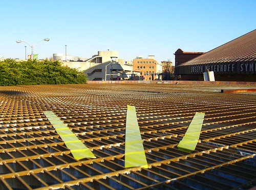
New Public Sites - Symphony Terrace Vista
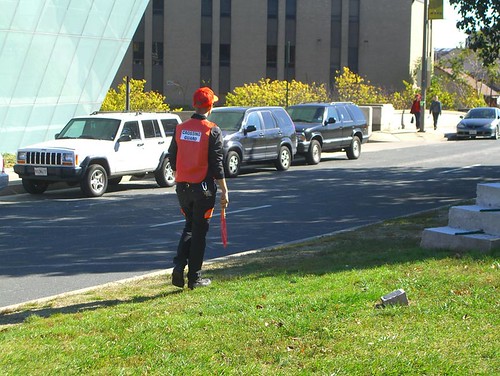
VXW-MTR Crossing Guard performance
Thursday, December 11, 2008
Leon Ferrari
These are some images of Leon Ferrari's mail artworks that I mentioned during Siobhan's critique yesterday. I scoured the internets and these were the best I could find to illustrate what I was talking about. Still not great, but most of these images come from Jeffry Cudlin's (Arlington Arts Center's curator) blog:
And here's a blurb about Ferrari's work at the Arts Center: "eón Ferrari, winner of the Golden Lion in the 52nd Venice Biennale in 2007. Ferrari will exhibit his heliographs—large prints that resemble labyrinthine city plans, and reflect on the political oppression of the Argentinean military dictatorship in the 1980s."
horay!
Wednesday, December 10, 2008
Tuesday, December 9, 2008
Three stories, three people, and three sets of maps. Stories of people trying to figure out where they are in the world in the most literal and least literal ways possible. We explore what it's like to be lost — how we all struggle in that moment not to give ourselves over to fear but try to enjoy it.
august 1999
archives
thisamericanlife.org
Sunday, December 7, 2008
WHOLE WIDE WORLD
http://theboxla.com/exhibitions/past/kiersten_puusemp/index.html
Thursday, December 4, 2008
Tuesday, December 2, 2008
Saturday, November 29, 2008
Thursday, November 27, 2008
Saturday, November 22, 2008
this one's for Scotty...
http://www.npr.org/blogs/monkeysee/2008/11/genius_i_tell_you_genius.html
not sure how this is really any different than just plain running, but what do I know?
Thursday, November 20, 2008
Wednesday, November 19, 2008
Michael Snow, Degrees of Remove: Landscape and Affect
SculptureCenter and Anthology Film Archives Present: Degrees of Remove: Film Series
This screening series was developed in the context of the exhibition Degrees of Remove: Landscape and Affect at SculptureCenter, on view through November 30. Degrees of Remove suggests the contemporary experience of landscape as increasingly mediated through documentation in urban societies. The works on view explore the representation of spatial constructs through fiction and affect, revealing how artists transpose spaces onto surfaces through various degrees of allegorical remove. Curated by Sarina Basta, Fionn Meade, and Anthology Film Archives.
PROGRAM 3: Special Focus on the Work of Michael Snow - Sunday, November 23 at 8:30pm
Using concert footage of CCMC, the free improvisational ensemble Snow co-founded in 1974, the filmmaker/musician digitally weaves together images and sounds from performances that have taken place across the globe. “I desired an equivalence of seeing and hearing so that one could actually listen, pay attention to the music, as well as follow the picture development,” Snow writes.
PROGRAM 4: Special Focus on the Work of Michael Snow – Monday and Tuesday, November 24 & 25 at 7:30pm
La Région Centrale (1971, 180 minutes, 16mm)
Made over the course of five days on a deserted mountaintop in North Quebec, the vertical and horizontal alignment as well as the tracking speed of Snow’s equipment was all determined by the camera’s settings. Anchored to a tripod, the camera turned a complete 360 degrees, craned itself skyward, and circled in all directions. Because of the unconventional camera movement, the result was more than merely a document of the film location’s landscape, as its themes became the cosmic relationships of space and time.
These programs take place at the Sculpture Center in Long Island City and at Anthology Film Archives in Manhattan. For more information: www.sculpture-center.org
Pedestrians & SIdewalks Opportunity
Urban Art Program
The Urban Art Program is an initiative to invigorate the City's streetscapes with engaging temporary art installations. A component of DOT's 'World Class Streets' program to transform ordinary public spaces into pedestrian-friendly hubs, art will be installed in public places and add to New York's vibrant street activity.
DOT will partner with community-based organizations to install temporary murals, sculpture, and other installations in plazas, and on medians, triangles, sidewalks, jersey barriers and construction fences. DOT will also work with organizations/artists on temporary art projections and lighting projects in plazas and on appropriate bridges (masonry on sides of bridges), viaducts, and archways, as well as performance art and musical and theatrical performances in plazas.
Organizations or organization-artist teams are invited to apply to one of
the three Urban Art Program tracks:
pARTners
Site to Site
Arterventions
It's simple! Download an application, fill out and provide required
supporting materials. Applications will be reviewed by DOT (Department of Transportation) and outside
advisors following the Selection Ranking System that includes: public
safety, artistic merit, site suitability, organizational capacity, and
artwork durability.
http://www.nyc.gov/html/dot/html/sidewalks/urbanart_prgm.shtml
Resampled Architectural Space
Here's something interesting that was on BLDG BLOG on the Belgian artist, Filip Dujardin:
Belgian photographer Filip Dujardin makes images of unexpected buildings – that is, he "combines photographs of parts of buildings into new, fictional, architectonic structures," Mark Magazine explains.
The resulting projects look like old factory sites in the American rust belt – Mark describes them as "informal and often dilapidated structures with unspecified functions"
Tuesday, November 18, 2008
Astronaut Loses Tool Bag in Space
This reminds me of a camera an astronaut lost in space:
Viewfinder project puts the flickr in Google Earth
The project site states: "Our objective is to provide a straightforward procedure for geo-locating photos of any kind, and our approach is to engage a community of users for a certain amount of human help."
Indeed, such ongoing web 2.0 panorama research is promising. I can't wait for this virtual/real hybrid place future...
Monday, November 17, 2008
The Neistat Brothers
Sunday, November 16, 2008
Hello Kitty + friends go to Paris!
check out article in SuperTouch
Tom Sachs up to his antics in Paris... foreign pop culture figurine turned universal icon turned globetrotters. ;P
Friday, November 14, 2008
Wednesday, November 12, 2008
Brilliant New York Times Prank by the Yes Men
The paper is dated July 4, 2009, and imagines a liberal utopia of national health care, a rebuilt economy, progressive taxation, a national oil fund to study climate change, and other goals of progressive politics. The hoax was accompanied by a Web site that mimics the look of The Times’s real Web site. A page of the spoof site contained links to dozens of progressive organizations, which were also listed in the print edition. (A headline in the fake business section declares: “Public Relations Industry Forecasts a Series of Massive Layoffs.” Uh, sure.)
Gawker is reporting that the prank looks like the work of the artist pranksters known as the Yes Men, who were the subject of a 2004 documentary film.
Later on Wednesday morning, the Yes Men issued a statement claiming credit for the prank. The statement said, in part:
In an elaborate operation six months in the planning, 1.2 million papers were printed at six different presses and driven to prearranged pickup locations, where thousands of volunteers stood ready to pass them out on the street.
Catherine J. Mathis, a Times spokeswoman, said: “This is obviously a fake issue of The Times. We are in the process of finding out more about it.” Alex S. Jones, director of the Joan Shorenstein Center on the Press, Politics and Public Policy at the Harvard Kennedy School, and a co-author of “The Trust,” a history of the family that controls The Times, said in a telephone interview that the paper should be flattered by the spoof.
“I would say if you’ve got one, hold on to it,” Mr. Jones, a former Times reporter, said of the fake issue. “It will probably be a collector’s item. I’m just glad someone thinks The New York Times print edition is worthy of an elaborate hoax. A Web spoof would have been infinitely easier. But creating a print newspaper and handing it out at subway stations? That takes a lot of effort.” He added, “I consider this a gigantic compliment to The Times.”
There is a history of spoofs and parodies of The Times. Probably the best-known is one unveiled two months into the 1978 newspaper strike. A whole cast of characters took part in that parody, including the journalist Carl Bernstein, the author Christopher Cerf, the humorist Tony Hendra and the Paris Review editor George Plimpton.
And for April Fool’s Day in 1999, the British business executive Richard Branson printed 100,000 copies of a parody titled “I Can’t Believe It’s Not The New York Times.” Also that year, a 27-year-old Princeton alumnus named Matthew Polly, operating a “guerrilla press” known as Hard Eight Publishing, published a 32-page spoof of the newspaper.
Make it yourself Hot Rod Car on a $300 budget!
Brett Doar, Sloan Fader and Tom Jennings converted a $300 "junker" an 88 horsepower Ford Escort into a race car that was raced in Jay Lamm's 24 Hours of LeMons. The entry fee of $500 for the race cost more than the car! The LeMons race covers 400 miles in 14 hours of driving over two days...therefor the adaptability of the vehicle is more critical than speed. A link to the entire article is HERE.
THEANYSPACEWHATSOEVER
Here are excerpts from his review/report in New York Magazine published Nov. 9, 2008:
NIGHT AT THE MUSEUM: Look at those curves! Who wouldn't want a one-night stand with the Guggenheim?
By Jerry Saltz
I have always wanted to have sex in a museum. To me museums are ecstasy machines, places to experience rapture, and the real thing is the real thing. So I jumped at what seemed like an unbelievable chance to carry out my fantasy: an opportunity to spend the night with my wife on a rotating queen-size bed fitted out with satin sheets on the sixth ramp of Frank Lloyd Wright's Guggenheim Museum. The work, Revolving Hotel Room, is Carsten Höller's major contribution to "theanyspacewhatever," a show devoted to the amorphous non-movement known as Relational Aesthetics. Höller's "room" has no walls, is out in the open on a large round Plexiglas platform, and has a guard posted nearby. If you get up to go to the bathroom in the middle of the night, the guard follows you. Intimacy under these conditions seemed dicey, but I had to try. And then, two days before our night in the museum, my wife's travel plans changed. She was going to be out of town that night. D'oh!
Before I tell you about my personal happy ending, however, some thoughts on the show itself. This cheekily titled outing is devoted to a clique of artists who reengineered art over the past fifteen years or so. They created the most influential stylistic strain to emerge in art since the early seventies. Their impact can be seen in countless exhibitions. Yet "the anyspacewhatever" is less a celebration of these artists than it is an example of well-meaning but incompetent curatorial irresponsibility-further proof, if any is necessary, that while Thomas Krens gallivanted around the world, muddying the Guggenheim brand, he was also ignoring curatorial operations back home in New York. "Theanyspacewhatever" was organized by the Guggenheim's Nancy Spector (whose Richard Prince survey last year turned this difficult artist into overpackaged product). Its ten artists, all in their forties, emerged in the early nineties. Relational Aesthetics is a public-oriented mix of performance, social sculpture, architecture, design, theory, theater, and fun and games. These artists view museums as imperfect Edens, playgrounds, battlefields, and sites for seriousness. Over the years they have inserted kitchens, couches, mannequins, and mirrors into institutions. Exhibitions and museums are a medium to experiment with and explore. To them, audience interaction is everything.
Unfortunately, Spector has removed most of the "relational" parts of this art and left us with plain old aesthetics. Wan ones at that, since their work was never that visual. Viewers drift through this show barely stopping; the exhibition is so tame that it's impossible to imagine anyone's being challenged to rethink ideas about art exhibitions. Part of the problem can be traced to Spector's narrow notion about the group, which hasn't been a group for some time. Part of it is that the Guggenheim simply can't allow (for example) Rirkrit Tiravanija to set up one of his ad hoc kitchens and dish out curried vegetables for free, allowing the refuse to pile up. Höller wouldn't be permitted to put hotel beds all over the museum, leaving the Guggenheim open all night to anyone who wanted to sleep over. Mmmmmm. So we're left with a show that fizzles instead of sizzles. Tiravanija's comfy video lounge, Dominique Gonzalez-Foerster's sonic rain forest, Douglas Gordon's wall texts, Liam Gillick's S-shaped benches, Philippe Parreno's lighted marquee, and Angela Bulloch's LED night sky are all okay. But the show is lackluster, as if the curator and artists were too busy to do more. Or maybe the artists instinctively fought against being confined by such a thin curatorial idea. And such a surprisingly limited roster. This kind of art sprang up when money left and a new nonvisual, conceptual-sculptural installation art appeared. It was an open, loose moment. Yet somehow, as its stars have ascended to fame and that shagginess has been organized into neat retrospectives, the women, as seems to happen every time, have been shortchanged. Andrea Zittel, Andrea Fraser, Trisha Donnelly, Cosima von Bonin, and Vanessa Beecroft are all missing. Whether or not they belong strictly in the in-group, yet again we've got a show that's 80 percent guys.
Which brings me back to my no-sex-in-the-museum evening. Höller's hotel room-booked solid at $259 to $799 per night-is the highlight of the show, and is too good to miss. After my wife canceled, I went anyway, alone. Arriving was fun: I was greeted at the door, got signed in, and was shown to my room. As the guard, Joseph, watched, I hung up my coat, unpacked, and set up my bedside table. After showering in what looked like a swanky executive bathroom upstairs, I changed into pajamas and a robe, and began roaming the museum (at one point sneaking into a classy office to put my feet up on the desk and pretend to call Bilbao). I lay down on floors and stood in empty galleries. At first, it was all a delight. Then it got weird. I felt very alone, as if I were in one of those last-person-on-Earth films. Paranoia set in, as the museum turned into a modernist minimum-security prison, a panopticon, and instead of feeling in control via looking at art, I felt like I was the thing being looked at. OMG, were there cameras trained on me? Probably. So I went to bed. As I lay there, I heard strange sounds-fans whirring, echoes reverberating. I couldn't sleep, despite earplugs and an eye mask. I began counting all the shows I'd seen here over the decades. Eventually, that did the trick, and around 2:30 a.m., I drifted off. The next thing I knew, Joseph was tapping his walkie-talkie on the bed, saying "Get up." I had slept the sleep of the dead. I took off the mask and saw that the lights were on and workers were moving about. It was 7:30. As breakfast (tea, croissants, pain au chocolat) was wheeled toward me, I noticed that I felt refreshed-that the Guggenheim, where I'd been a thousand times, looked utterly new to me. I was in love with the place. The museum had become a cradle of sorts; the environment seemed whole and enveloping. I had the strange feeling of having merged with the structure, like we really had slept together. The next week, when I returned to the show by day, I noticed that when I passed by the bed where I spent that night, I was filled with tender feelings. It was like walking in a city and looking up at a window in a building and remembering a long-ago night when you'd had sex there. Weirdly, however, I was also filled with something like jealousy. I felt like "my museum" was sleeping with everyone else. I found myself wondering why the Guggenheim hadn't called the next day.
Monday, November 10, 2008
Google Earth Street With a View
by artists Robin Hewlett and Ben Kinsley
This brings street theater to a whole new paradigm. Google needs to start advertising when they are doing their panoramic street scans so we can think of more fun stuff to help represent our respective neighborhoods.
I especially appreciate their decision to act out urban scenes that would not be totally out of the ordinary, had they not all taken place on one day along a small back alley. Such subtleties truly helps blur their fiction into convincing half-truths.
Most of this post was lovingly borrowed from Ceci Moss's post on Rhizome. THANKS!
Cliff Evans EMPYREAN - paralax internet collage video masterpiece...
see trailer below...
EVERYONE MUST SEE THIS MIND WARPING / HYPNOTIC VIDEO INSTALLATION!
a statement.
Sunday, November 9, 2008
systematic landscapes
Good article about Maya Lin's new Wave Field at StormKing in NY. http://www.nytimes.com/2008/11/09/arts/design/09kino.html?ei=5070
Also includes an excellent video, be sure to check it out!
statement of purpose
new writing, what do you think
December 3 - 10, 2008 in Middendorf Gallery (Station Building)
Maryland Institute College of Art
Opening Reception: Wednesday, 4-7pm
http://wndrng.blogspot.com
When you begin to explore the process of A to B, destination is erased entirely. You are immersed in the possibilities of vastness where all the unknowns are inviting you to participate in full. It is an energy that swells through, each with an intention uniquely significant and a cause specifically irrelevant. By limiting place, and expanding space we create a realm for our minds to roam that is limited only by the extent of our curiosity.
“Wandering: You are Here” is an exhibition about the explorative process of psychogeography. Psychogeography, coined by the Situationists Guy DeBord and Asger Jorn, maps the mind onto the terrain, and the terrain onto the mind. Join Eve Laramée and other artists to wander and drift through explorations of actual geographic places, represented psychological spaces, and “lived” or “other” thirdspace.
This exhibition investigates three aspects of space and place: its physicality, narrative and memory, and relationships to the “other”. Discover the boundaries and definitions of both natural and man-made geographical place through artwork that addresses organic landscape, architecture, public infrastructure, deserted areas, and cyberspace. Unearth latent symbols of space in history, memory, invented narratives and nostalgia. Lastly, conduct environmental fieldwork and interact in real time with functional objects, key people, and daily routine. Saunter into the Middendorf Gallery via a “visionary crosswalk;” sit in a moment of meditative silence; race a runner on the “TreadMeal;” investigate homes in the wilderness, city, internet, inside, and outside. Come see our creations of the derivé.
Saturday, November 8, 2008
statement from alex oslance
Friday, November 7, 2008
Artist statement/sentence
Thursday, November 6, 2008
"New Public Site - Symphony Station" - brief description
statement of sorts
Wednesday, November 5, 2008
More Words: ARts!@
Treadmill History of Art
Scotty, this is probably way redundant, since there's been over 41 million viewings on YouTube, but in case anyone hasn't seen it, here's a historical precedent for treadmill art.
} { along the commingled paths of the world and books. . .
"Don Quixote is not a man given to extravagance, but rather a diligent pilgrim breaking his journey before all the marks of similitude. He is the hero of the Same. He never manages to escape from the familiar plain stretching out on all sides of the Analogue, any more than he does from his own small province. He travels endlessly over that plain, without ever crossing the clearly defined frontiers of difference, or reaching the heart of identity."
"He believed himself to be progressing, from similitude to similitude, along the commingled paths of the world and books but was in fact getting more and more entangled in the labyrinth of his own representations. "
- michel foucault, 1966, 46, 210). . . from "the order of things; an archaeology of the human sciences" -
( one of the best Foucault bks )